

We'll discuss your goals, current challenges, and how our process can help to drive real business growth.
YouTube
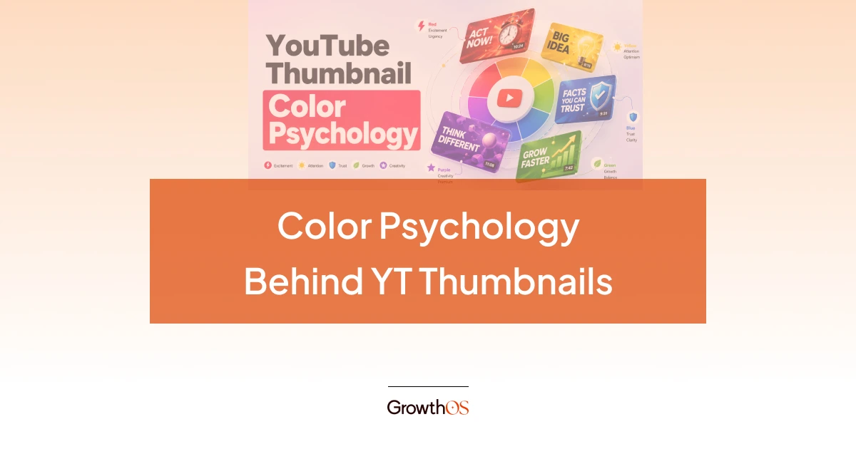
YouTube Thumbnail Best Practices to Grow Your Channel in 2026
Rutvik Shirude
April 10, 2026
5 min
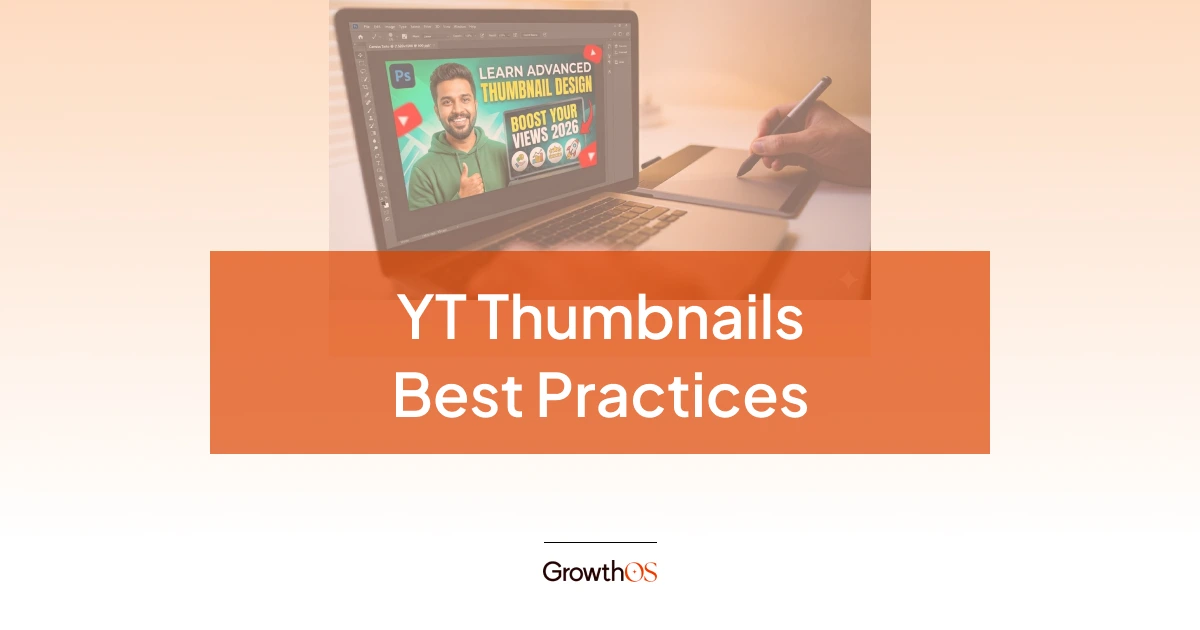
TABLE OF CONTENTS
A YouTube thumbnail is the small preview image that represents your video in search results, the Home feed, and Suggested videos.
According to YouTube’s official documentation, 90% of the platform’s best-performing videos use custom thumbnails.
The YouTube thumbnail best practices that separate high-CTR creators from everyone else come down to 5 principles: understand why viewers click (the curiosity gap), design the thumbnail and title as a single unit, use 2-3 visual elements maximum with bold colors and expressive faces, keep text to three to four words, and A/B test variations using YouTube’s Test & Compare. Content creators often treat thumbnails as a design task when it is actually a strategy problem.
This article covers the theory behind why viewers click, then the design execution that makes it happen.
TL;DR
The best practices for creating high-impact, high-CTR YouTube thumbnails are:
Design the thumbnail and title as a single unit. The thumbnail should open a curiosity gap that the title gives context to, never repeat it.
Keep text to three or four words maximum. Use bold, sans-serif fonts that stay legible when the image shrinks to mobile size.
Faces with strong, exaggerated emotions consistently outperform text-heavy or object-only thumbnails. Research shows expressive faces can lift CTR by 20-30%.
Upload at 1280x720 pixels, 16:9 aspect ratio, under 2MB (now upto 50 MB), in JPG or PNG format. Keep critical elements away from the bottom-right duration badge.
Use YouTube's Test & Compare to upload three thumbnail variations per video as A/B testing. YouTube picks the winner based on watch time share, not just clicks.
Why Do Viewers Click? The Theory Behind YouTube Thumbnail Best Practices
Before opening Photoshop or Canva, you need to answer one question: what will make someone stop scrolling and click? The answer has less to do with color theory and more to do with psychology.
Thumbnails Are a Promise, Not a Poster
A thumbnail is a contract between you and the viewer. It promises an experience, and the video has to deliver it. This matters because YouTube’s algorithm now prioritizes viewer satisfaction over raw click-through rate.
If you check Google’s documentation about YouTube thumbnails, they have explicitly mentioned that you should ensure your thumbnail accurately represents the video. Misleading thumbnails may get an initial click, but the resulting drop in retention signals low quality to the algorithm and buries the video in recommendations.
The key concept here is the curiosity gap. Effective thumbnails create just enough intrigue to make the viewer need to click, without revealing the payoff. For example, showing the "before" without the "after," or framing a surprising result without explaining how. The thumbnail opens a loop; the video closes it.
How the YouTube Thumbnail Algorithm Actually Works
The YouTube algorithm does not "see" your thumbnail the way a human does. What it sees is the click-through rate (CTR), which is the percentage of people who click your thumbnail out of everyone it was shown to. The average CTR on YouTube falls between 2% and 10%, depending on the niche, audience, and traffic source.
It all works in a synced loop: a high CTR signals relevance to YouTube, which increases impressions (the number of times your thumbnail is shown), which compounds your YouTube video views. A low CTR does the opposite, even if the video itself is excellent.
One interesting thing to note here is that CTR from the Home feed (where your thumbnail competes against dozens of others) tends to be lower than Search CTR (where the viewer already has intent), so the design approach should differ by traffic source.
YouTube Thumbnail Design Best Practices That Drive Clicks
With the theory covered, here is how to execute. These YouTube thumbnail design best practices tie directly back to the psychology above.
Design the Thumbnail and Title Together, Not Separately
This is the most underused tactic in YouTube content strategy. Your thumbnail and title should function as a single unit. The thumbnail shows; the title tells. Neither should repeat the other.
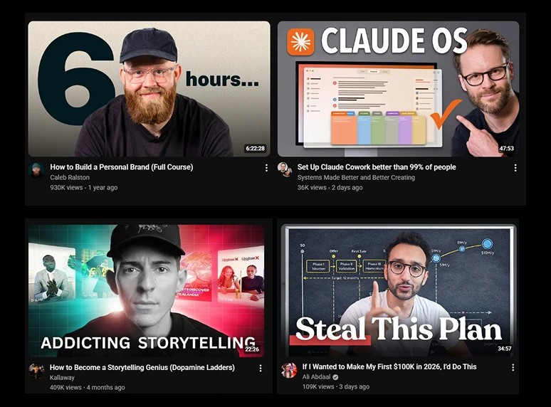
For example, check the thumbnail by Oleg Melnikov; his video’s title is “How I Use Claude Code For B2B Outreach (35% Reply Rate)," but he hasn’t reflected any of that literally in the thumbnail design or text. Instead, he just wrote $132K in Sales with 2 icons: Claude and LinkedIn suggesting he used two tools to do the outreach. This combination creates the curiosity gap.

💡 Pro Tip: Design your thumbnail and write your title before you shoot the video. If you cannot think of a compelling thumbnail-title pair, the video idea may not be strong enough to earn clicks. This is a workflow that top creators, including Ali Abdaal and MrBeast, follow consistently.
Composition: Keep It to 3 Elements or Fewer
A YouTube thumbnail is typically viewed at roughly 320x180 pixels on mobile. At that size, details are barely visible. The most effective thumbnails use two to three visual elements maximum: a face, an object, and a text overlay, or a face and a background. A few rules that consistently drive results:
- Use the rule of thirds for image composition. YouTube recommends this directly. Place the main subject off-center to create a dynamic visual.
- Faces with strong emotions outperform text-heavy thumbnails. Research shared by TubeBuddy consistently shows that expressive faces can lift CTR by 20-30%.
- Use high-contrast, bold colors that stand out against both YouTube’s light mode and dark mode backgrounds.
- Avoid the bottom-right corner, where YouTube’s duration badge overlaps your image.
Text on Thumbnails: The Less-Is-More Rule
If you add text, limit it to 3-4 words. Use bold, sans-serif fonts that remain legible at mobile size. The text should complement your title, not duplicate it. If your title says "5 Budget Lighting Setups for YouTube," the thumbnail text might read "GAME CHANGER" or "UNDER $50" paired with a couple of images of lighting gear rather than repeating "Budget Lighting."
YouTube Thumbnail Size and Technical Specs
These are the baseline requirements. Getting them wrong will hurt your video before anyone even sees the content.
As of early 2026, YouTube has begun rolling out 50MB thumbnail support, primarily for smart TV screens. You can now safely upload thumbnails up to 50 MB on desktop. But if you’re still seeing upload errors or using mobile, stick under 2 MB for now.
How to Test and Improve Your YouTube Thumbnails
Designing a thumbnail is not a one-and-done task. The best-performing creators treat thumbnails as living assets that get tested and updated over time.
The Mobile Preview Check
Before publishing, shrink your thumbnail to phone-screen size. If the text is unreadable or the composition feels cluttered, go back and simplify. Over 70% of YouTube views happen on mobile devices, so designing on a large monitor without testing at a small scale is a costly mistake.
💡 Pro Tip: Preview your thumbnail alongside competitor thumbnails. Search for your target keyword on YouTube and see how your design holds up next to whatever is already ranking. If it blends in, it will not get clicked.
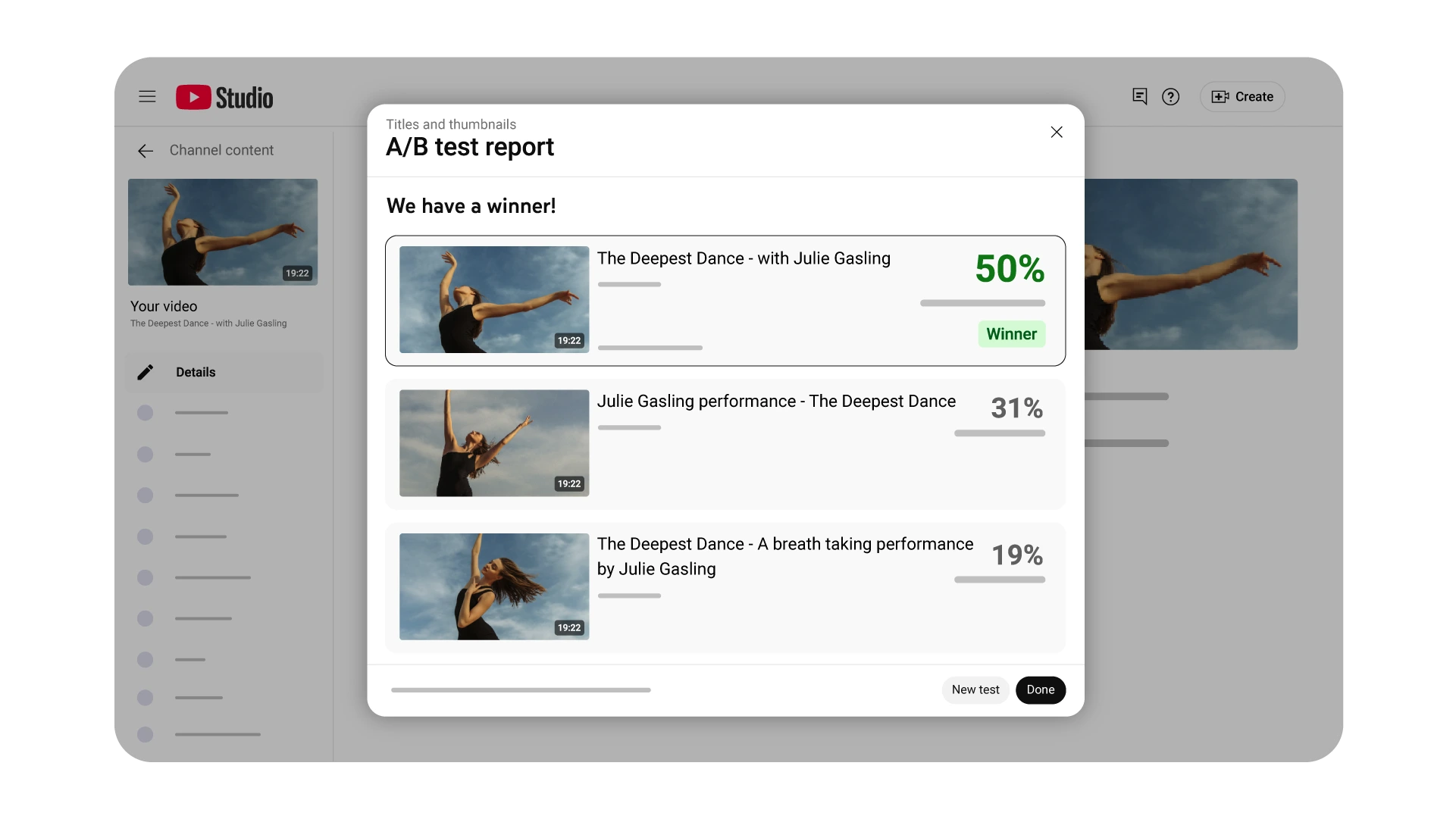
A/B Testing with YouTube’s Test & Compare
YouTube’s Test & Compare feature lets creators upload up to three thumbnail variations for a single video. YouTube shows each version to different audience segments and, after up to 14 days, selects a winner based on watch time share (not raw CTR). This means a thumbnail that drives high clicks but low retention will lose to one with fewer clicks but longer watch time, directly reinforcing the "promise, not a poster" principle.
As of December 2025, YouTube also rolled out title A/B testing globally. Creators can now test up to three titles, three thumbnails, or combinations of both.
This makes the thumbnail-title pairing strategy even more actionable: test different pairings and let the data decide.
Are Thumbnails Important for YouTube Shorts?
Yes, but their role is different. Shorts thumbnails do not appear in the Shorts feed itself, where content autoplays. They do appear on your channel page (the Shorts shelf), in search results, and in suggestions. This means they primarily influence whether someone browsing your channel or searching taps on a specific Short, which eventually leads to higher views.
The best practice is to select a visually striking frame that represents the hook moment. Keep it clean and skip dense text overlays, since the vertical format leaves limited space. There is one caveat, though. If you upload a 16:9 custom thumbnail to a vertical Short, YouTube may replace it with an auto-generated 4:5 crop on certain surfaces. Always include at least one strong, thumbnail-worthy frame inside the Short itself as a fallback.
Need help building a content strategy that drives organic growth on YouTube and beyond? Talk to the GrowthOS team or explore our thumbnail design services to see how we can help.

Rutvik Shirude
Co-Founder
Rutvik shirude is a Co-Founder and YouTube growth strategist at GrowthOS. He currently leads agency ops, manages client channels and strategizes YouTube growth of B2B and DTC brands. Outside of work he loves to watch cricket, F1 and do photography. You can find him on Instagram, YouTube, LinkedIn.

More insights
Get Growth Insights Delivered to Your Inbox
Join B2B marketers getting weekly strategy breakdowns on SEO, AI search, PPC, and YouTube—straight talk, no generic advice.
Oops! Something went wrong while submitting the form.


.svg)